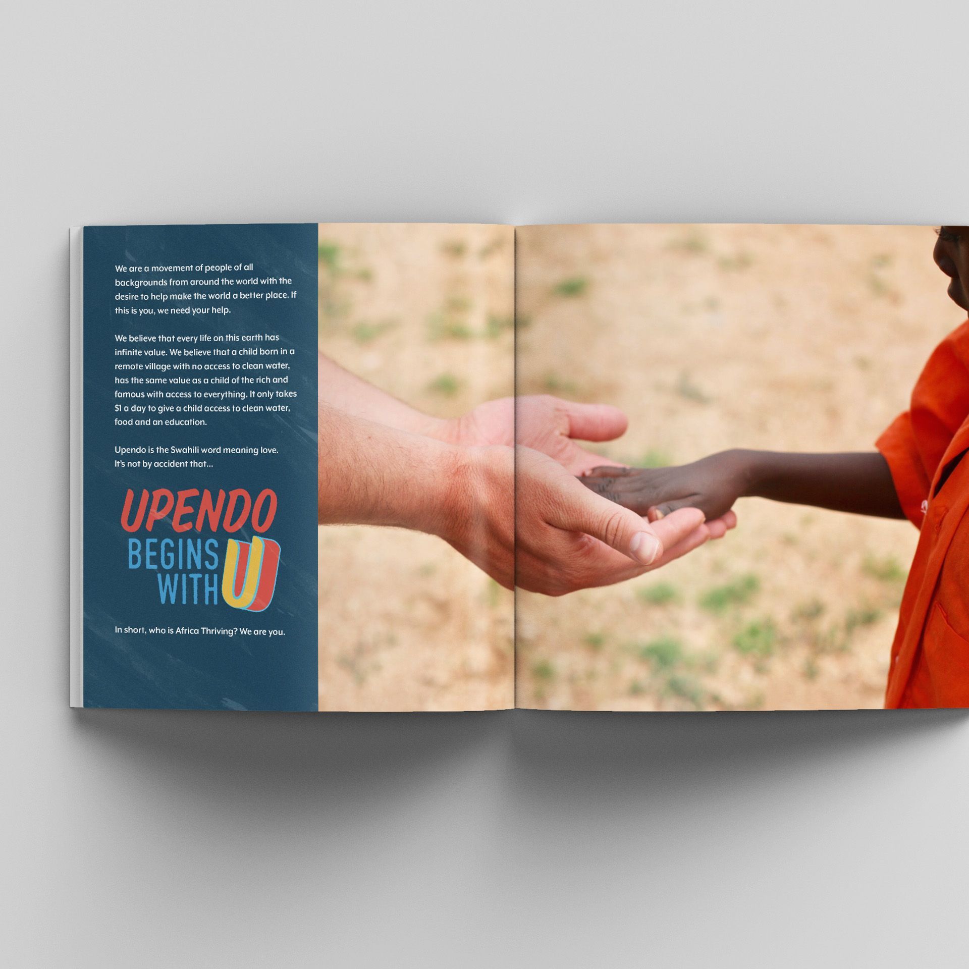
Africa Thriving is a non-profit that partners with schools and local leaders in areas of Africa that struggle to access clean water and food. They provide immediate nourishment to prevent famine and develop a plan with community leaders to have a permanent water source that is self sustainable.
Africa Thriving approached us to help them synthesize their messaging and come up with a cohesive brand identity. We call this identity Bodega, - Bodega is based around the hand painted signs that you would find driving around downtown Nairobi. We wanted the prant to feel hand drawn but elevated so it holds up across all mediums. The color palette also reflects the red clay earth of africa and water, which Africa Thriving helps provide.
We extended this brand to the website, which feature abstract shapes that help tie in the site photography to the new logo.